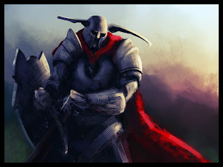

Finally working on the color illustration...

The above image is me dropping the sketch onto the old value comp, plus working it up a lot more. Something was lost though and I'm not sure what the composition is lacking now... I may paint back in those ribbons but I don't think that will be the full answer - more to come.

Working on a better drawing of the character to place in the scene. I'm hoping this is more proportionate than she is in the color comp. I'm also hoping her leg isn't broken haha... seems reasonable to me :P
//last edit


First attempt at a color comp for my final illustration, as well as a new value composition. I will probably end up sticking with the new composition. More to come.

Still looking for a composition with a good feel to it... Some of these are getting there. I think 3F could be good with a more clear background (but it is a thumbnail afterall). I'll probably try some landscape ideas - that might work better for me.

Not sure about these compositions, but I always had the idea that this character would be in more of a peaceful looking and forested environment. This is a war, but the character is named Serene for a reason. Shes the one that can restore peace to the world. I want the demons to be frozen/turned to stone, or bound somehow, and be represented as ornaments in this area. I'm not really sure how to do that yet, but this was an ok first step... If anyone is actually reading this, comments/feedback would be most appreciated!

Working on a new comp. This idea started from the first thumbnail on the page - it's as if a HUGE demon ripped through the dimensional wall (provided story) and acted as a carrier for the invasion forces. This large demon would probably be torn to pieces or scathed as a result of moving between dimensions... I have to make it kind of horrible, they are the bad guys! :P
 This was fun, but not exactly how I was expecting to use the lower space... I needed the foreground elements to add to the sense of depth but these guys don't do a very good job of that. They do, however, show off her ability more clearly than it is currently on the larger guy. In any case, time for a new composition!
 An earlier version (below):
-------------
Hey guys, I officially joined the war today :D I'll keep this post updated as I go along, although you will also be able to see my work being posted at this thread...
http://www.gameartisans.org/forums/showthread.php?t=7834
If you want to learn more about this challenge, check my last post. It began on Sunday and will go till May 11th... that means you can still join and have plenty of time to participate!
So the War is pretty open ended. My job is to create a character that is either a norm (pretty much any human or anthropomorphic being) that is either a warrior, cleric of sorts, or spell caster. In their possession they must have an item of great magical power. Pretty typical fantasy stuff really, but that's not a bad thing. The other races that could be chosen are Machines or Demons. All would be really cool - I'm tempted to go the Demon route so I can really produce something bizarre, but I need the practice concepting human characters...
My character will essentially be a bard, though for the rules of the comp its considered a "clericon" I want to develop a clothing style that is similar to the Art Deco fashion, but with a futuristic - post apocalyptic feel to it. That's the goal anyhow, and I'm far from it. Heres the beginning.
The head in G came out pretty funny in this thumb, so I rendered it a little bit more to show people what I saw...
(I really like the drawing B on this page, but it's not quite my character...)
Random sketch:


